for people who design things, then print them
Designing Artwork Ready For A Newspaper
What needs considering when designing for a newspaper?
The Short Answer
- Save your PDFs using the PDF/X-1a preset
- Use Adobe Acrobat's Preflight & Output Preview to check your PDF
- Keep your text size above about 8pt
- Limit your ink coverage to 245%
- Be careful when using white text on a coloured background
- Ask the newspaper what colour profile to use
- Sharpen your photos
The Long Answer
I recently had someone contact me asking how to get the best out of their newspaper adverts. The designs looked great, but they just weren't printing as strongly as hoped. I've now expanded my email reply and turned it into this article. Thanks Hashi for the prompt.
Rubbish Paper, Rubbish Print

The reason you have to think a little differently for a newspaper is down to two main reasons: poor quality print and poor quality paper.
When you consider the speed a newspaper press works at and the cost of a typical newspaper the quality is actually very impressive. But compared to other design jobs (flyers, brochures, business cards) the quality is understandably lower.
As a result there are a few things to think about and a few tips that are worth knowing...
Use PDF/X-1a
PDF/X-1a is a good solid PDF preset to work with. It's kind of out of date but it's robust. I'd recommend this unless the newspaper states another preset. The other option I may sometimes use is PDF/X-4. I may even send two files to a printer if I'm not completely confident in them and will mark the files clearly – design_file_name[PDFX1a].pdf and design_file_name[PDFX4].pdf.
Use Adobe Acrobat's Preflight and Output Preview tools
There are a couple of tools I use all the time to check artwork. These are both in Adobe Acrobat Pro.
Output Preview

This is a brilliant tool for analysing what is actually happening in the file. It will help you see where there may be too much ink on the page – which tends to not work very well on newspaper paper.
It will also show you if you're using any Pantone colours, which a newspaper can't print. They will probably just convert the Pantones to CMYK but you're best doing that yourself.
Preflight
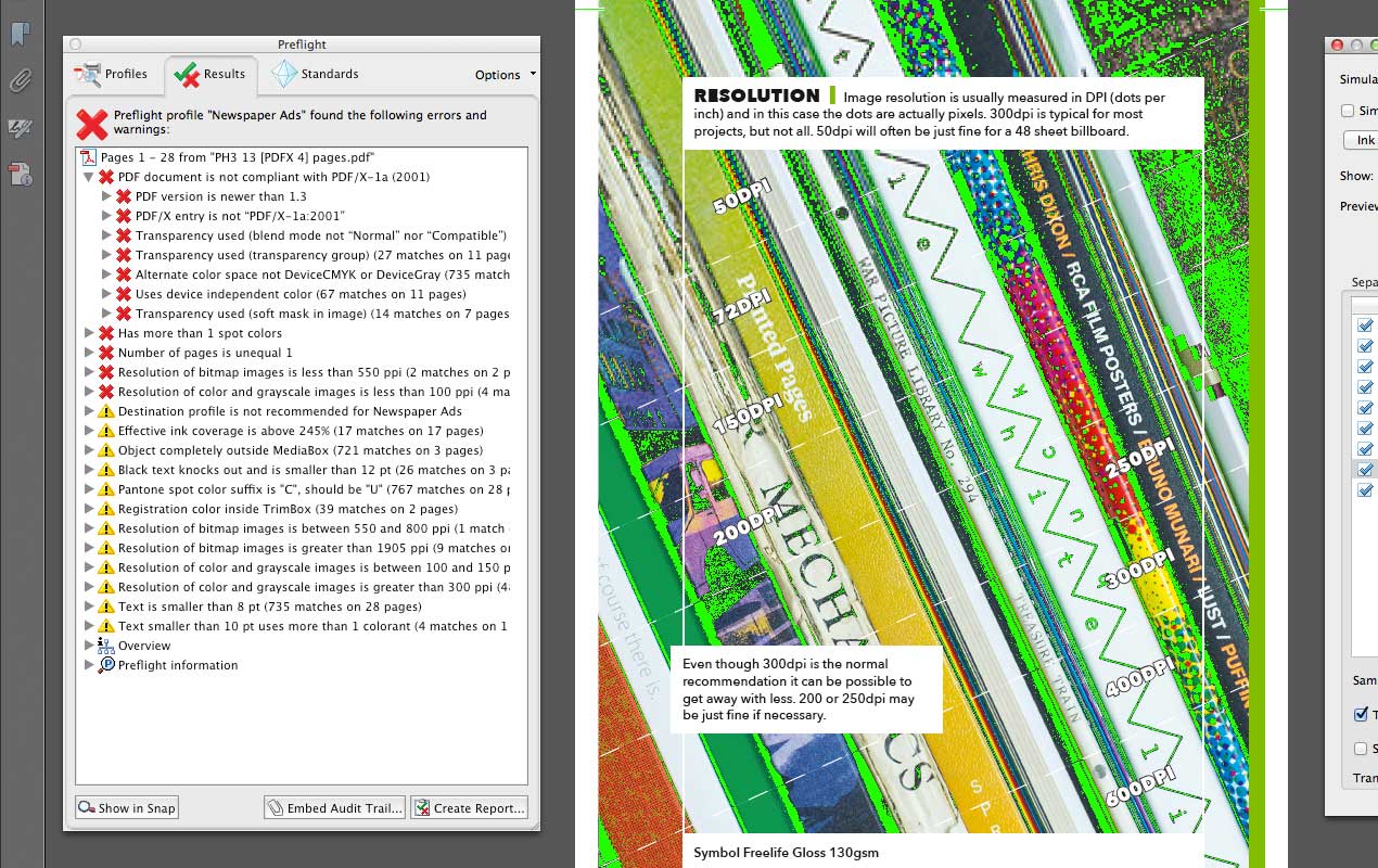
The preflight tool does a series of checks to flag up what might cause issues for a particular type of printing.
There is a newspaper checker so give that a try. Click the newspaper profile and then click analyse. The warnings in this are all really valuable – the yellow triangles.
Font Size
Multiple ink text
I actually think that black text on white prints pretty well in a newspaper. I guess it has to considering that is basically what a newspaper is.
But when it comes to text using multiple inks (like CMYK 50/25/10/0) things start to get tricky. The inks rarely match up exactly when printing something, and this is even more the case in a newspaper.
If you do want to print text using multiple inks make sure it's large enough (probably above 10pt) and that it isn't too light a weight.

White text on coloured background
White or light text on a coloured background can be a disaster in a newspaper.
If you need to do it then make sure your text is big enough and bold enough to survive the printing process. The above example is almost impossible to read, but the design below uses big and bold text and is easy to read.

Sharpen Images
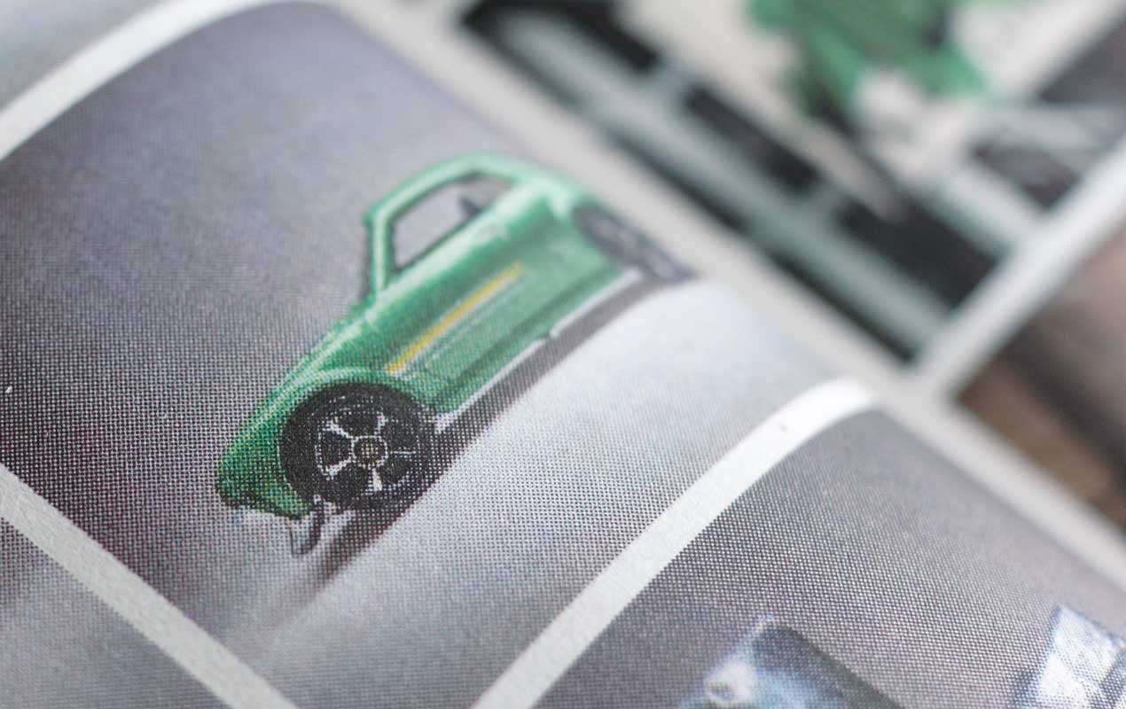
When it comes to including photos in your design then sharpening them is always worth doing, even when not printing in a newspaper.
A good rule of thumb is to view your 300dpi image at 50% in Photoshop and use the Smart Sharpen or Unsharp Mask filters to add some sharpening. It takes practise to get it just right.
Be careful not to overdo it. It's better to not sharpen enough than over sharpen. A decent Smart Sharpen setting to start with would be around 75%/1px. Give that a try and tweak up and down to get it just right.
Not Too Much Ink
Because newspaper is such an absorbent paper it can't handle a lot of ink well. So you need to bear this in mind. Use too much ink and your designs will look dark and dull.
Use Adobe Acrobat's Output Preview tool to see how much ink you are using and then adjust any graphics or images to keep it below 245% (your newspaper may specify a different amount). If small areas are over this then don't worry too much. It only becomes a problem if large areas of the design are using too much ink.
Colour Profiles

Colour profiles are complicated, there's no other way of saying it. Because of this I always think it's best to ask the printers or newspaper what colour profile to use.
If they're not sure then use something like FOGRA39 in Europe or CGATS21-2-CRPC6 in North America.
Practise
With almost all design work things take practise. Learn from your mistakes by picking up the paper your design is in and see how it compares to the other designs in the paper.
Good luck. And if you have a question for me like Hashi did then .
Update
After I published this article I had a very helpful email from Yvon who said...
"If you get a chance, look up the SNAP ICC profile for US newspapers. It’s been out a while, a consortium of key players got together sometime in 1984, and their latest update is ca. 2011:
http://www.snapquality.com/Home_Page.html
I’ve had good results using SNAP in Canadian newspapers and since earlier this year, US newspapers as well"
Take a look, especially if you're in the US or Canada. You can find out more about what Yvon's been up to here: Fox & Found Letterpress and LinkedIn.
Swatchos

Choose Colours With A Deck Of Cards
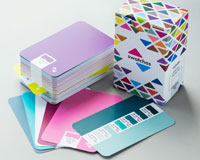
A box of cards for choosing colours and making colour schemes.
- 130 Cards
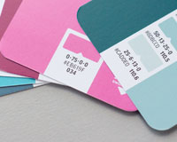
- CMYK Values
- RGB Values
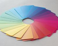
- 900 Colours
- Millions of combinations
£36 / $47 / €43
Brought to you by
Swatchos
Pick Colours With A Deck Of Cards
A box of 130 cards for playing with colour. For digital or print creatives. RGB and CMYK values. Millions of combinations.
