for people who design things, then print them
Colour Spaces & Colour Profiles
Which colour space should I use?
The Short Answer
Use sRGB for creating web graphics.
Use Adobe RGB when taking photos and editing them.
It gets a little more complicated with CMYK so it's best to speak to your printer. Ask them which colour profile to use. It can vary depending on material, press and country. If you really just need to pick one use FOGRA39.
The Long Answer
Let's be honest about colour spaces – they're hard to understand. It's a hard concept to get your head round but we'll go through it step by step. And hopefully at the end of it all it will make a bit more sense.
Thank you Ben Long
First, let's start with this brilliant video from lynda.com and Ben Long. Ben does an incredible job of getting us started with all this.
If you want to see more of Ben's videos (mostly photography focused) you can take a look at his lynda.com page.
Colour Profiles: It's all about language
Let's imagine two people trying to talk to each other. We'll call them Mr Nikon (a camera) and Mrs Epson (a printer). They don't speak the same language. Mr Nikon speaks in RGB and Mrs Epson speaks in CMYK.
They both talk about colour. And they both talk about the same colours, but they use different words (colour values) to describe them. The camera might describe a dark red flower as #990000 but the printer would describe it as 8/100/96/37. It's the same colour described in two different languages.
Imagine then that when talking Mr Nikon and Mrs Epson both each have a translator with them – this is their colour profile. It's actually a little bit of extra data linked with a file or device, but in this case we'll imagine them as a human translator. The translator's job is to make sure everyone is talking about the same thing. They let the printer know what sort of red the camera means, and they do this in the language the printer understands (CMYK).
A conversation between a camera and printer
With all that in mind a conversation between Mr Nikon and Mrs Epson might go like this...
Mr Nikon: I just captured this amazing image of some #990000 flowers. Could you print that colour for me?
Mr Nikon's Translator: By #990000 he means this specific dark red.
Mrs Epson's Translator: Great. I think we can do that dark red. I'll talk to Mrs Printer and explain what you mean.
Mrs Epson's Translator: Mrs Printer, we need to produce an image and the flowers need to be 8/100/96/37.
Mrs Epson: No problem. I'll get cracking.
Colour spaces
That all seems pretty simple. But let's now imagine if you have several translators all speaking the same language (like RGB), but some have a bigger vocabulary. They can talk about a bigger range of topics. They can describe colours that other translators can't. In simple terms this method of translation is their colour space.
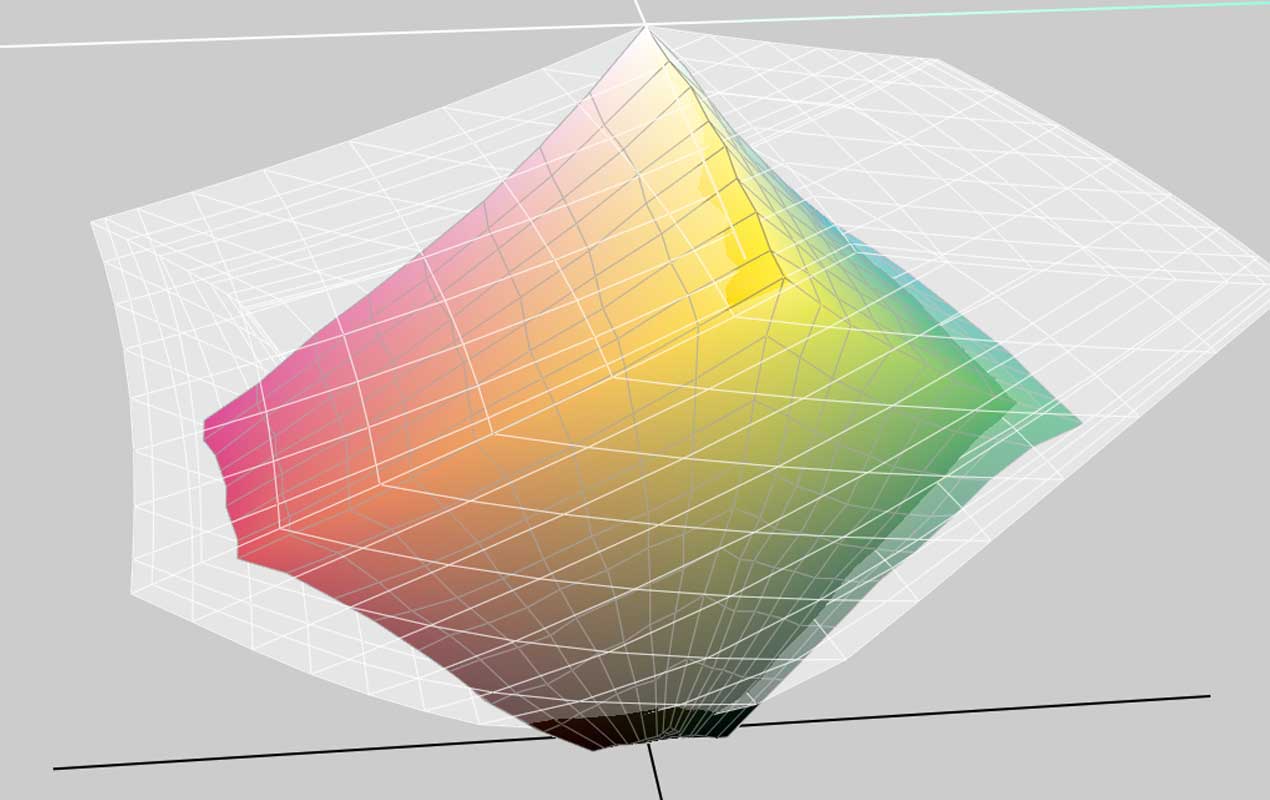
Two colour spaces you may well have heard of are sRGB and Adobe RGB. They both use the RGB language but Adobe RGB can describe more colours than sRGB. It has a larger vocabulary or gamut. There are colours that Adobe RGB can describe that sRGB cannot.
Adobe RGB vs sRGB

We'll end the analogy there and take a look at a diagram.
The above show a visual representation of the real life colours that two colour spaces can display or capture. The larger one (in white) is Adobe RGB, the smaller is sRGB. You can see in the diagram that there are bright greens that Adobe RGB understands which sRGB cannot.
Like Ben says in the video two colour spaces can refer to the same colour in different ways. So, a blue sky might be described as #607696 by Adobe RGB but sRGB would call this same blue #557799.
So, when would you use sRGB?
With Adobe RGB being able to display more colours you would think it must be worth using this all the time. Well not exactly.
Most people's computer screens can produce all the sRGB colours but not all the Adobe RGB colours. So, for a project that is going to be shown on screen (like a website) you might want to work within that limitation to prevent any surprises.
So sRGB works well here.
What about ProPhoto RGB?
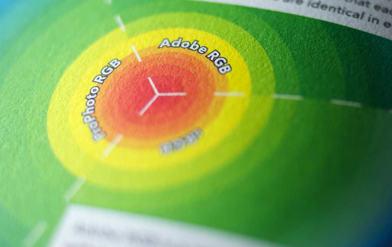
ProPhoto RGB is another colour space you may have heard of. It's even bigger than Adobe RGB so why not use this then?
As Ben says in the video when you have a huge colour space then you also start to spread out the colours. And as a result you may start to see banding in the images.
Adobe RGB is a good all rounder – not too big and not too small.
OK, so what about CMYK colour profiles?
CMYK colour profiles vary even more than RGB ones.
When choosing a CMYK profile for a print project you are best to speak to your printer. The profile to use will vary depending on material, press and country.
Choosing the correct profile at the start of the project is the best way to get a good idea about how images will produce when printed.
If you do need to pick one without speaking to a printer then go with FOGRA39. It's a solid CMYK colour profile.
Still want to know more?
Questions about ICC Profiles or colour management – The ICC answers some FAQs
How Should We Calibrate Monitors for the Web? – Some thoughts about calibrating your monitor if you do web work too
Rendering Intents and Gamut Mapping – An interactive look at how rendering intents affect output
Wikipedia Pages
Wikipedia is a great place to get in-depth information. But be warned it isn't always the easiest to understand.
Swatchos

Choose Colours With A Deck Of Cards
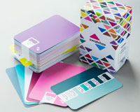
A box of cards for choosing colours and making colour schemes.
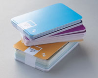
- 130 Cards
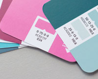
- CMYK Values
- RGB Values
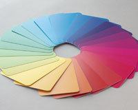
- 900 Colours
- Millions of combinations
£36 / $47 / €43
Brought to you by
Swatchos
Pick Colours With A Deck Of Cards
A box of 130 cards for playing with colour. For digital or print creatives. RGB and CMYK values. Millions of combinations.
