for people who design things, then print them
7 Essential Tips for Presentation Folder Printing
Supported Article
CompanyFolders.com got in touch to see if they could write an article for me on the topic of 7 top tips for presentation folder printing. I thought that sounded like a great idea, so here's the article...

Folders can be a fairly homogenous medium, and if you haven’t worked with them before, it can be difficult finding a way to stand out from the crowd. CompanyFolders.com offers an extensive selection with over 100 unique presentation folder styles to choose from, so it’s easy to customize a piece that fits your professional brand. Of course, even after you decide on the type of folder you want, you still need to print your design—and there are plenty of things that can go wrong.
Fortunately, Company Folders has also prepared a detailed Folder Design Cheat Sheet to help clients ensure that their artwork is fully prepared for printing. Below is a sneak peek at some of the most valuable tips. It’s absolutely vital to keep these tips in mind as you select imprint methods and plan out your pocket folder’s design within the die cut template file.
1. PMS ink is best for one-color designs or color matching.

A pre-mixed PMS ink is most cost-effective when your design consists of only one color. It’s also the best choice when you need to match the precise hue of a company’s brand colors; you won’t get the slight variations that CMYK can sometimes produce.
2. CMYK is best for designs with multiple colors.

For multicolored designs, you’re going to want CMYK ink, also known as four color process. This method grants you access to a full spectrum of color (though certain hues such as navy blue and orange are more difficult to produce).
3. “Pure black” isn’t the best black.

When you’re using CMYK and want a portion of your design to be pure black, you might naturally assume that the best way to achieve this is to set that area to 100% black and 0% every other color. But in fact, you can achieve a much richer, deeper black color with the following formula: 60% Cyan, 40% Magenta, 40% Yellow, 100% Black.
4. For true blue, use 30% more cyan than magenta.

Similarly to black, blue is a tricky color to work with in CMYK; it often ends up looking purple on the final custom printed product. To achieve a richer, more pure blue color, make sure the cyan hue is set 30% higher than the magenta. For instance, if an area is at 40% Magenta, it should be at 70% Cyan.
5. Experiment with metallic or fluorescent colors.

Using PMS ink opens you up to new creative possibilities, including metallic colors (which include reflective metallic particles) and radiant fluorescents. These can add eye-catching interest to your printed piece. Be aware that these effects cannot be achieved with four color process.
6. Try embossing or debossing long-fibered stocks.

Embossing and debossing allow you to imprint a design directly into the shape of the paper by either raising or depressing it. This tends to work best on stocks with long fibers; the effect will be dramatic and noticeable. Short-fibered stocks, on the other hand, are often more fragile and the embossing or debossing effect will be muted.
7. Avoid fonts that are too small or thin.

With embossing, debossing, and foil stamping, areas with fine detail are very problematic. Fonts with tiny serifs, for instance, often don’t show up correctly when using these methods. To avoid readability issues, make sure all elements of your embossed or debossed text are at least 2 pt thick. For foil stamped text, it should be at least 1 pt thick. Avoid serif fonts, and avoid sizes smaller than 12 pt.
Want to ensure that your folder design will print correctly? Download and explore Company Folders’ Design Cheat Sheet for more tips, guidelines, and information.
Download Folder Design Cheat Sheet(at companyfolders.com)
Swatchos

Choose Colours With A Deck Of Cards
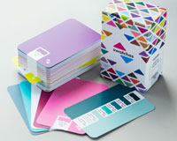
A box of cards for choosing colours and making colour schemes.
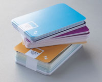
- 130 Cards
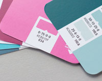
- CMYK Values
- RGB Values
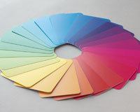
- 900 Colours
- Millions of combinations
£36 / $47 / €43
Brought to you by
Swatchos
Pick Colours With A Deck Of Cards
A box of 130 cards for playing with colour. For digital or print creatives. RGB and CMYK values. Millions of combinations.


